
By Kayt Duncan
There is a small symbol quietly undermining my organisation’s communications. It appears in headings, in policy documents, on websites, in training materials, in email newsletters and in PowerPoint slides. It is two keystrokes instead of three. It looks vaguely stylish. And most of the people using it have no idea they are doing anything wrong, or that they are the reason for my silvering hair.
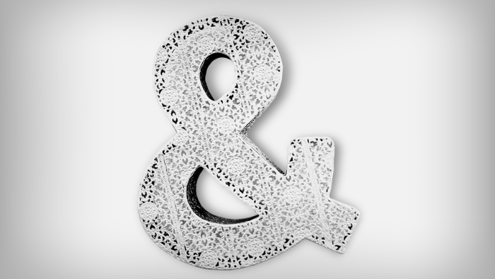
I curse its name under my breath. Oh, how I hate thee, ampersand: &.
After calming breaths in a darkened room post another lengthy session find-and-replacing “&” to “and” in yet another handbook, I can with a clear conscious acknowledge that my gripe isn’t really against the symbol itself but rather what the ampersand represents, and what it misses. That single character marks a gap between content that is correct and content that actually communicates. That gap costs organisations trust, clarity and reach, and it tends to be widest when the audience most needs the content to be clear.
Just to clarify, I am not an ampersand averse. I would proudly join the “&” cheer squad high V’ing its justified place in typographic folklore. Beginning life as a ligature created by cursive-writing Roman scribes around the first century AD, the ampersand was a fuse of letters e and t (the Latin word et, meaning “and”) into a single flowing mark to save scribing time. Its adoption was manifest, almost comparable with today’s uptake of LOL. In fact, one publication from 1499 printed by the Venetian printer Aldus Manutius, boasts twenty-five ampersands on one page alone. While my colleagues endeavour to break this record, I am hesitant to believe it’s because of any coordinated #Manutius hashtag activism.
The word “ampersand” itself has a wonderfully convoluted origin. In early English schools, children recited the alphabet using the Latin phrase per se, meaning “by itself”. The symbol was listed after z as “and per se and,” which, slurred together over generations of schoolroom recitation, eventually became “ampersand”. For a period in the nineteenth century, the ampersand was formally considered the twenty-seventh letter of the English alphabet. I shudder typing this as I hear my son in the background timely reciting his current school learning: “six-seven, six-seven”. The horror of it.
I digress. In short, the ampersand is a character with 2,000 years of history, a fascinating name, and a very specific job description, that has been quietly ignored ever since the smartphone and two-thumb typing arrived. The rise of emoji-laden communications is yet to bleed into the guidance from major style authorities, which remains consistent and clear with respect to the ampersand. It is the persistent flaunting of the saving of two character spaces, in spite of the guidelines, that fires up the tsk-tsking voice in my head, the tightening of my shoulders and furrowing of my brow.
Previous iterations of The Australian Government Style Manual stated directly: avoid using ampersands unless they are part of a company name, trademark, or financial market abbreviation. The current edition doesn’t even grace the character with a subheading, hiding references to its use in the sections discussing names and referencing. What better way to encourage its reduced use by requiring you know how to spell it for the search feature. I have to type how many characters?
From a design perspective, the rule is equally established. The ampersand belongs in display typography, such as logos, possibly (and with restraint) headings, but it is not a substitute for the word “and” in body copy, lists or documents. There are a small number of legitimate exceptions: registered company names (Dolce & Gabbana, H&M, Ben & Jerry’s), certain academic citation styles, screenwriting credits, and space-constrained contexts such as tables, charts and business cards. Outside these situations, the word “and” is the correct choice.
Even if I could make peace with the rampant anti-establishment style guide sentiment that has taken hold in my workplace, there is more at stake than compliance. And that is the accessibility argument. This is where the stakes against the ampersand start to rise.
The ampersand is not universally understood. For readers with certain cognitive impairments, it can require significant effort to decode the ampersand, effort that the word “and” does not demand. For screen readers the ampersand is inconsistently handled. Some text-to-speech applications only recognise it if it has been coded in a specific way in HTML, a step that most content creators, including my entire workplace, never take.
My organisation serves a majority audience with English as an additional language or dialect (EAL/D), requiring adherence to Plain English for all publications to ensure maximum comprehension. Plain English uses standard punctuation that is generally more accessible for everyone. Excluding symbols and special characters from Plain English considerations creates a real localisation problem. While “and” can be translated into any language, the ampersand creates genuine uncertainty, particularly in digital content, where UI style guides may deem the symbol part of a proper name and therefore exclude it from translation. Imagine presenting my audience a one-page document on a screen with 25 instances of incomplete sentences.
For organisations communicating with audiences that include a high proportion of EAL/D speakers or those with low English literacy, this matters considerably. Research consistently shows that plain language benefits all readers, including highly educated ones. It also shows that it is essential for those navigating content in a second or third language.
The ampersand is a small but real obstacle in that path.
So why does it keep happening?
This is the question I sit with. And I don’t believe I am alone. In most organisations, people producing content with ampersands scattered through it are not careless. They are knowledgeable, well-intentioned and competent. They are producing accurate information. So, what is going on?
Several forces are at work simultaneously.
Digital habits have blurred the line. The explosion of texting, social media and informal chats and email has normalised character shortcuts. The ampersand has been rehabilitated as casual shorthand in a way that now feels natural, and those habits flow directly into professional documents; convenience and ease the underlying influence.
Nobody told them the rule. Many employees learned to write partly by imitation, looking at what the organisation and peers around them produced, and what they could find quickly as an immediate reference. This is certainly the case within my workspace where operational and process documentation is sparse, and mentor and peer support is sadly lacking. If referenced documents contained ampersands, the practice was modelled as acceptable. Without clear, accessible style guidance, the & simply propagates with no systems in place to curb it.
It looks right in headings. There is a genuine logic to the ampersand in display design. It’s compact, visual and echoes the world of branding and signage. As a designer myself, I agree that logic has some validity in logos and marketing materials. The problem is that the same instinct gets applied to body copy, course handouts and policy documents, where it has no place.
The audience stays invisible. Perhaps most significantly, employees writing internal-facing content such as policies, training resources and handouts often do not picture who will read it. They write for a notional competent adult who resembles themselves. May my CFO never be allowed to publish straight to the web! The reader for whom English is an additional language, or who uses a screen reader, or who has a cognitive processing difference, or just finds reading difficult, simply does not appear in their mental model of their audience.
This is not unique to the ampersand. It is the central challenge of plain English communication: getting writers to shift from “I have conveyed this information accurately” to “my reader can understand and use this information”. As Plain Language researchers note, accurate information that cannot be correctly interpreted by the reader is, functionally, a communication failure.
One small symbol creates one big comprehension gap.
The ampersand is an ideal case study precisely because of its smallness. It is not a complex grammatical problem or a contested point of style. The rule is clear, the exceptions are limited and the fix takes less than a second. Yet in my organisation it persists. It reigns supreme in policies, training slides, newsletters, across multiple teams and platforms because no one has made it a priority, because style guides are either absent or unenforced and, critically, because writers are producing content for themselves rather than for their readers.
If an organisation cannot get “and” right across its communications, it is worth asking what else is slipping through: the jargon that EAL/D readers cannot parse, the passive constructions that obscure accountability, the long sentences that lose readers halfway through.
The ampersand is a proxy. What it reveals is not a style problem but an audience problem. When writers cannot picture the reader on the other side of the page, small gaps open up everywhere: the symbol that confuses, the jargon that excludes, the sentence that loses someone halfway through. The fix for the ampersand costs nothing. It takes one extra keystroke. It asks only that the writer pause for a single second and ask: who is reading this, and what do they need to understand it? That pause is the whole job. Switch your Shift 7 for a, n, d – every document, every time.
#And
References
Australian Government Style Manual. (2023). Grammar, punctuation and conventions. Australian Government.
https://www.stylemanual.gov.au/grammar-punctuation-and-conventions/punctuation/punctuation-and-capitalisation
Content Design London. (2019). Ampersands. Readability Guidelines. https://readabilityguidelines.co.uk/grammar-points/ampersands/
Cumberland Council. (n.d.). Using & — ampersand. Content design and style patterns. https://www.cumberland.gov.uk/design-and-content-guidelines/content-design-style-and-patterns/using-ampersand
Eye on Design. (2017, June 13). This is what happens when you put out a call to designers for ampersands. Eye on Design. https://eyeondesign.aiga.org/this-is-what-happens-when-you-put-out-a-call-for-ampersands/
Fonts.com/Monotype. (n.d.). The ampersand character: History and usage. Fonts.com. https://www.fonts.com/content/learning/fontology/level-3/signs-and-symbols/the-ampersand
Government Communication Service. (2025, October 29). Accessibility standards. Government Communication Service. https://www.communications.gov.uk/guidance/accessible-communications/accessibility-standards/
Loranger, H. (2017, October 8). Plain language is for everyone, even experts. Nielsen Norman Group. https://www.nngroup.com/articles/plain-language-experts/
Pangram Pangram Foundry. (2025, December 17). From et to ampersand. The Academy. https://pangrampangram.com/blogs/journal/ampersand
Proofed. (2023, October 5). Using ampersands. Proofed Knowledge Hub. https://proofed.co.uk/knowledge-hub/using-ampersands/
Scope for Business. (2025, May 19). How special characters affect screen readers. Scope for Business. https://business.scope.org.uk/accessibility-screen-readers-special-characters-and-unicode-symbols/
SitePoint. (2024, February 29). Typography: The origin of the ampersand. SitePoint. https://www.sitepoint.com/origin-of-the-ampersand/
Victorian Government. (2025, August 26). Victorian Government style guide. vic.gov.au. https://www.vic.gov.au/victorian-government-style-guide
Wikipedia contributors. (2025). Ampersand. In Wikipedia, The Free Encyclopedia. https://en.wikipedia.org/wiki/Ampersand [Supplementary reference — not peer-reviewed; used for historical etymology overview only]
Note: All URLs verified May 2026. Where no individual author is identified, the organisation name is used as the author in accordance with APA 7th edition.
—– TBD
Australian Government Style Manual: stylemanual.gov.au
Britannica, “Ampersand” (2026): britannica.com/topic/ampersand
Bernoff, J., “Why to Avoid Ampersands in Formal Writing” (2025): bernoff.com
Cumberland Council Content Guidelines, “Using & — Ampersand”: cumberland.gov.uk
Emmitt, D., “Ampersand (&) or and?” (2023): debbie-emmitt.com
Nielsen Norman Group, “Plain language is for everyone, even experts” (2019): nngroup.com
Pangram Pangram Foundry, “From et to ampersand” (2025): pangrampangram.com
ProBizWriters, “Ampersand usage — & or and?” (2015): probizwriters.com
Readability Guidelines, “Ampersands”: readabilityguidelines.co.uk
Scope for Business, “How special characters affect screen readers” (2025): business.scope.org.uk
SitePoint, “Typography: the origin of the ampersand” (2024): sitepoint.com
Costa, D. (2023, October 5). ampersand. Encyclopedia Britannica. https://www.britannica.com/topic/ampersand
Author disclosure
This article was developed with the assistance of Claude (Anthropic) as part of personal upskilling and AI technology experimentation. Claude was used to source and compile research references, produce an initial structural article outline from clear and comprehensive instructions, and guide editorial feedback across multiple drafts. All opinions, professional observations, personal anecdotes and commentary, and final editorial decisions are the author’s own. The author reviewed all AI-generated content and editorial commentary and revised the article across multiple drafts.