by Helen Bradford AE
Most of my clients are government departments and NGOs. Their projects often include data presented in text, tables and charts. When I edit their work, I sometimes suggest alternative ways to present the data. For example, long paragraphs containing data may be better presented in a table or chart.
When I edit charts, my checks include:
- consistency and accuracy of captions
- correct referencing of sources
- consistency with the list of figures
- consistency with other charts
- spelling, punctuation and grammar.
If I find a chart hard to understand I will raise a query with the client, but I generally don’t feel qualified to suggest an alternative approach.
For a while now, I’ve followed the work of US data specialist Stephanie Evergreen by reading her blog posts and watching her free webinars. After working on a report that contained a lot of charts I found hard to decipher, I decided to take the plunge and enrol in one of Stephanie’s courses.
Stephanie offers three online courses (think of them as basic, advanced and professional). I’m enrolled in the advanced course, which is called The Data Visualization Academy. The course includes more than 200 tutorials that you work through in the order, and at a pace, that suits you. There’s also a community forum to ask questions, get advice and interact with other students.
Although I’ve only recently started the course, I’ve already picked up lots of useful tips and learnt new skills my clients will benefit from. The first thing that resonated with me is the similarity between how to analyse text and how to analyse a chart to improve ways to present them. Both involve this process:
- clarify the purpose of the content and the main point it is trying to convey
- clarify who the audience is and in what format they will access the content
- decide the best way to present the content to achieve the purpose and suit the audience and format.
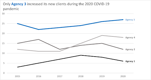
There are lots of easy, but effective, ways to adapt how you present data in a chart to make it quicker and easier for your audience to understand your point. For example, in the first line-chart I created, I used these techniques:
- Use data labels instead of a legend. This not only frees up space, but also makes it easier for people to interpret.
- Use a conclusion statement as the title of the chart. The chart contains lots of information, but this title tells your audience the point you want to highlight.
- Use colour in the title and line, and a thicker line, to highlight the key point.
Here’s the chart I developed, using a made-up subject and data:
For now, I’m focused on enjoying the course and progressing through the tutorials, but next year, I plan to develop a new, complementary service to help my clients improve the ways they present their data.
Helen Bradford AE (edanz.ab@iped-editors.org)